Brand Guidelines
The "Veryfi" name and the Veryfi logo, and other Veryfi trademarks, are property of Veryfi Inc. These guidelines are intended to help our partners, resellers, customers, developers, consultants, publishers, and any other third parties understand how to use and display our trademarks and copyrighted work in their own assets and materials.
Get Started for Free Book a Demo
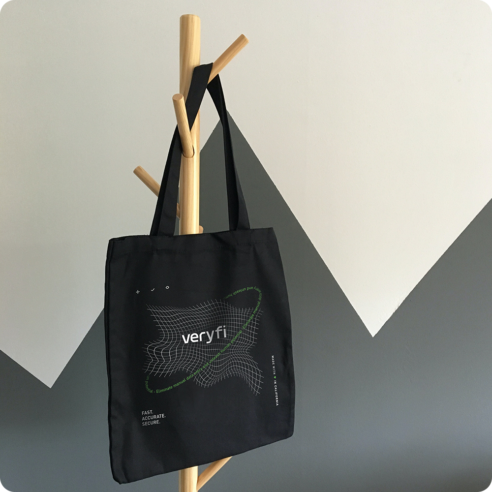
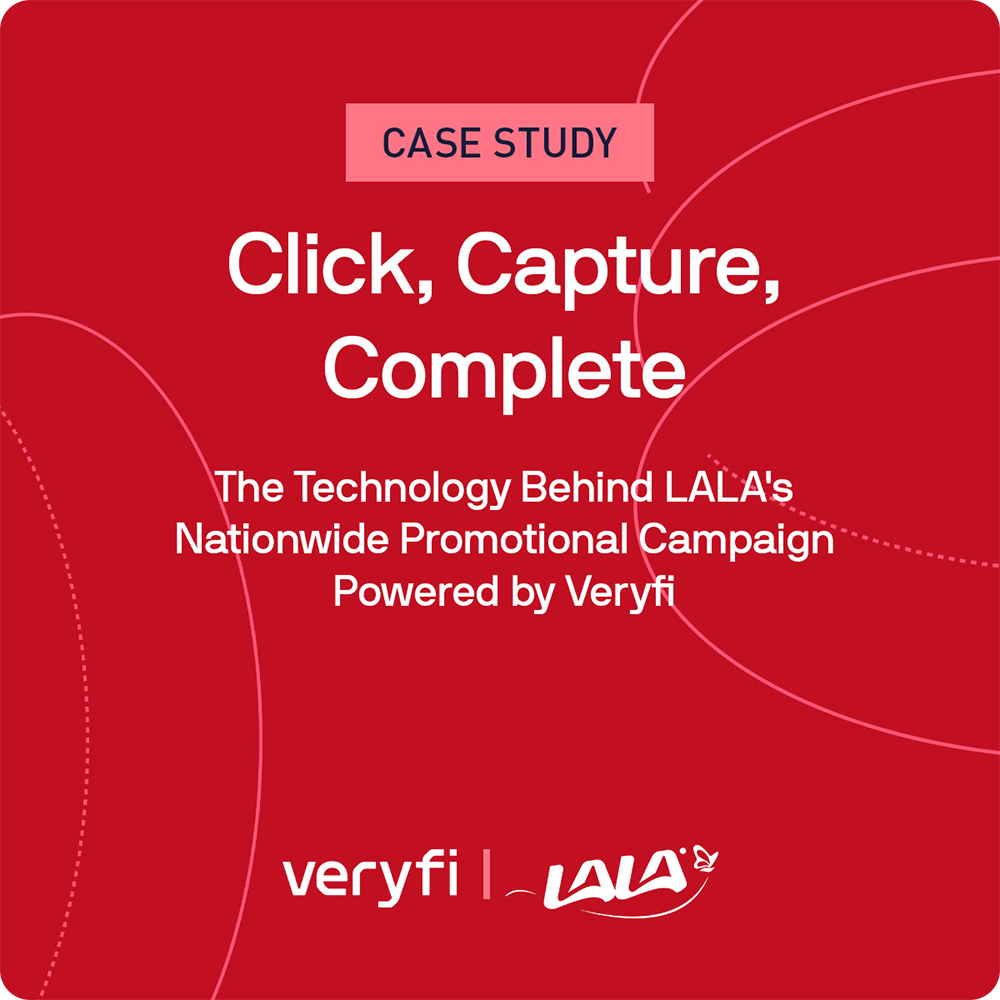
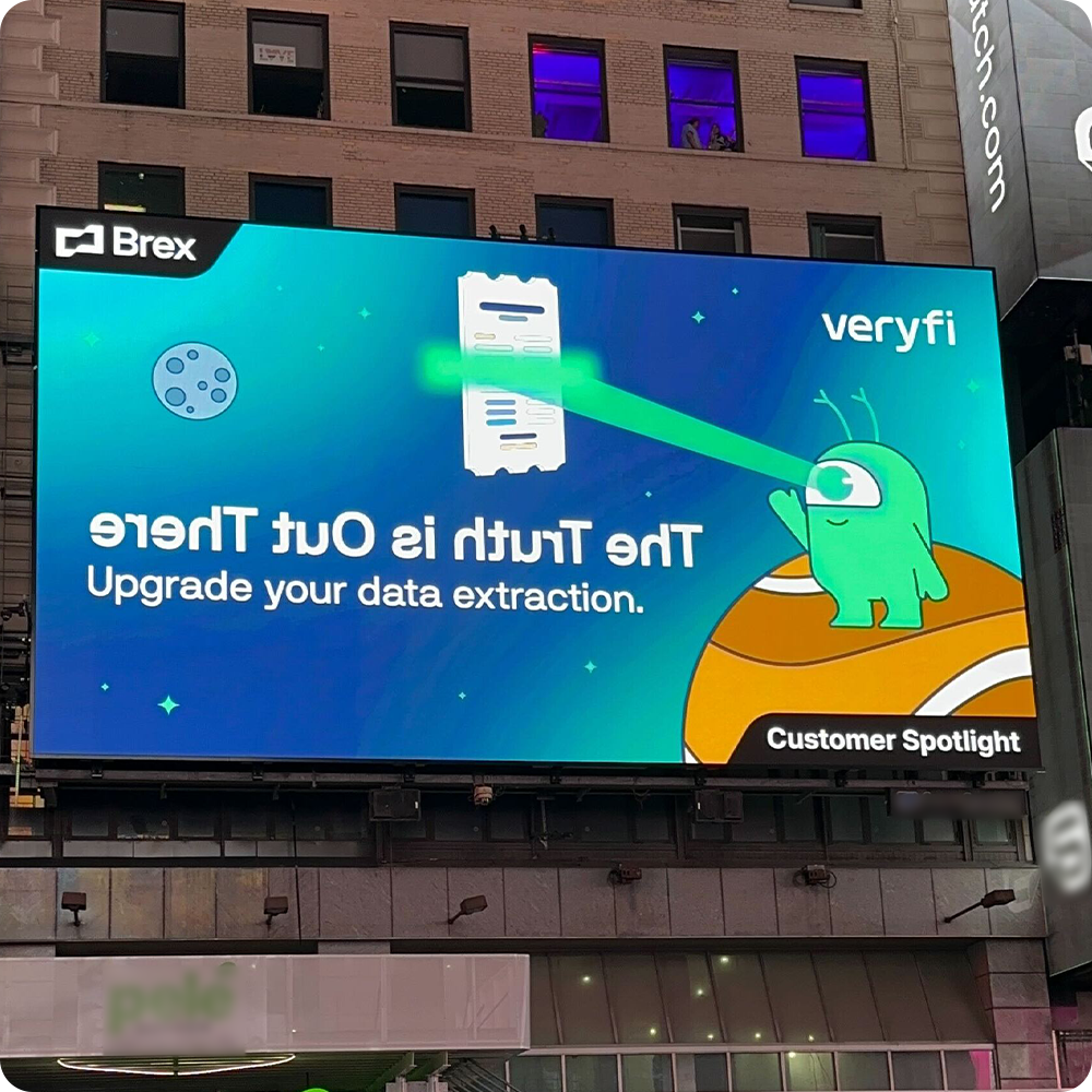
Brand Gallery


Our logo
Wordmark
The Veryfi wordmark is the most recognizable element of our brand. It must be used thoughtfully and consistently across all touch points. It features custom geometry inspired by the classic OCR-A typeface (1968), a nod to the early era of machine-readable text. This connection underscores Veryfi’s longstanding expertise in machine vision, multimodal AI and document intelligence.
Clear Space
To protect legibility and visual impact, maintain clear space equal to the height of the “v” in the logotype around all sides of the logo. No text, graphic elements or boundaries may enter this area.
Minimum Size
• Print: Minimum Width: 1cm
• Digital: Minimum width: 90 px
Scaling below these thresholds compromises legibility and is not permitted.

The “V” Mark (Alternate Logo):
The “V” Mark is a simplified symbol and derived from the primary logotype. It is used only when special constraints prevent the use of the full wordmark.
How to Use Our Logo
Do
- Use approved brand colors only
- Maintain paper clear space
- Ensure sufficient contrast and accessibility
- Use vector assets whenever possible
- Follow minimum size guidelines
Don’t
- Don’t use unapproved colors (including pure black)
- Don’t add outlines, shadows, glows, gradients, or filters
- Don’t stretch, distort, or rotate the logo
- Don’t place logo on low-contrast or visually busy background
- Don’t place logo inside shapes or containers unless part of an approved template
- Don’t apply the “V” mark in place of the full wordmark when there is adequate space
Typography
Primary Typeface
NB International represents our voice. It is a geometric sans serif with soft curves and a high x-height, providing exceptional clarity and readability across interfaces. A clear typographic hierarchy should be maintained across all applications. We principally use: Regular and Bold .
- Primary website typography.
- Marketing materials.
- Headings & subheadings.
- UI labels & product interfaces.
- High-level brand communications.
Secondary Typeface
DIN Pro complements NB International with an industrial, utilitarian aesthetic. Its condensed proportions and excellent legibility make it ideal for technical dense environments. DIN Pro enhances functionality and structure while maintaining brand cohesion.
- Long-form documentation.
- Tables, data-heavy layouts, and product secs.
- Supporting text in dashboards or UI.
- Supplementary small titles (often in uppercase).
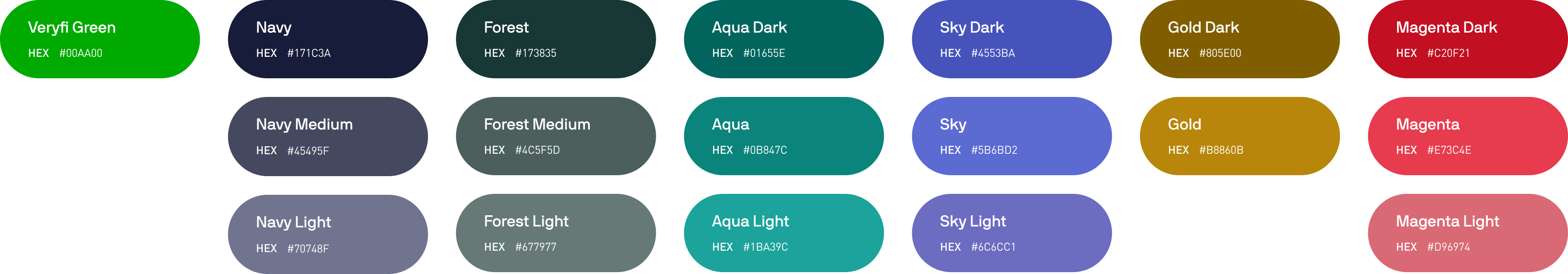
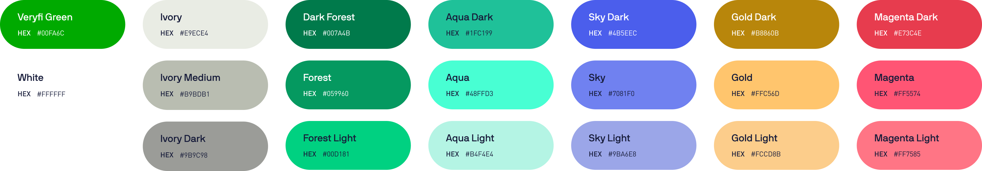
Color System Overview
Main Colors
Core brand colors used for primary surfaces, large brand areas, gradients and UI emphasis.
Secondary Colors
Supporting tones used for charts, highlights, callouts and expanded visual flexibility.
Gradients
A signature Veryfi brand element used for hero areas, backgrounds and large-scale compositions. Only approved gradients may be used.
Light Mode
The Light Mode color palette is a rich, Web Content Accessibility Guidelines (WCAG) compliant palette. It’s designed for use exclusively on dark backgrounds. Veryfi does not have black in either color palette, do not replace Navy with Black.
Dark Mode
The Dark Mode palette is optimized for use on light backgrounds and forms the backbone of Veryfi’s digital ecosystem (website, product, documentation). These colors meet and exceed WCAG contrast requirements for use on light-surfaces. The colors are lighter and more vibrant, ensuring strong contrast when placed over Veryfi’s Navy or other dark surfaces.
Brand Partnerships
When combining wordmarks with partner logos, ensure balanced spacing and a clear visual hierarchy. Keep logos sufficiently apart to maintain clarity and visual impact. Each logo should be presented at the correct size, in its approved color format and without any distortion or alterations. All co-branded materials must be reviewed and approved by both brands to ensure consistency and compliance with branding guidelines.

Do
- Use the established spacing rules
- Strive to have the wordmarks be the same height
Don’t
- Don’t add any colors to the partnership lockup
- Don’t use the wordmark as very different sizes
- Don’t use the partnership lockup over a busy image.
Usage Terms
The term “Marks” includes anything we use to identify our goods or services, including Veryfi’s name, logos, icons and design elements.
Permission to use our Marks is limited in the following ways.
- • Only use Marks if they adhere to our brand guidelines.
- • The permission we grant is non-exclusive and non-transferrable.
- • Do not feature our Marks more prominently than your own company’s name or marks.
- • We may update the guide and changes must be made in accordance with our updates within a reasonable time.
- • We can review the use of our Marks and require changes if needed.
- • We may terminate permission to use our Marks at any time, and usage must stop promptly.