The Veryfi Brand and the History of OCR
Our company was co-founded in 2017 by Dmitry Birulia and Ernest Semerda, two friends and engineers that met at coupons.com and decided they wanted to solve a massive, costly problem in business: manual data entry. Veryfi is a Y Combinator company (W17) in Silicon Valley, the global heart of technology innovation for the past 67 years. Dmitry and Ernest wrote a blog post about the Veryfi origin story if you’d like to learn more about our company’s early days and gain insight into the co-founders’ thoughts on reimagining our brand.
Veryfi is a leading provider of AI-driven OCR technology. Spanning decades, the history of ocr is punctuated by innovations in adjacent technology areas: flatbed scanners, personal computers, and now artificial intelligence (AI) enabled by today’s supercomputing power. Veryfi is at the forefront of applying AI to OCR technology to further improve its accuracy and flexibility in extracting data from varied document types and layouts.
In 2022, we decided that we wanted to reimagine our brand so that it reflects our core values while paying homage to the innovators before us. We took our first steps knowing that we wanted to carry forward our OCR heritage while showing the world where we aspire to take it. We met with a number of marketing agencies to discuss our vision for our brand, and ultimately selected HOO KOO E KOO as our partner. They stood out as an agency that has worked with innovative B2B startups that balanced unconventional ideas and approaches with trust and expertise.
Our Verbal Identity
Work on our brand journey started with multiple sessions to interview employees, brainstorm, and converge on expressions of foundational brand concepts: Purpose, Vision, Mission, and Values. Our challenge here was to write universal statements that were specific about what we do and the problems we solve, while not being specific to any single use case for our technology (e.g., FinTech Software, Loyalty Marketing, AP Automation, etc). Below are the foundations of our verbal identity.
Our Purpose
Manual data entry isn’t just antiquated and inefficient — it’s outright dangerous. We exist to liberate human potential by unlocking the data that shapes our world.
Our Vision
We envision a world where data-driven change has transformed society, resulting in every industry working better — where people are liberated from the misery of tedious data entry, and the resulting misery caused by human error, to live more streamlined and fulfilling lives.
Our Mission
To create this world, we provide intelligent software that instantly, accurately, and securely transforms unstructured data into actionable insights that solve specific problems.
Our Values
During our conversations about our values, we frequently returned to the concept of Trust, and how we seek to embody it. We’re dedicated to being open and transparent as individuals, and also being open and transparent about our technology. We make our technology available to try for free, including a web demo that site visitors can use to check how accurately our platform performs with their documents – without any specific AI model training, templates, or human intervention to guide it.
Ultimately, after much deliberation, we settled on the following values that we feel represent our company and us as a team:
- Trustworthy — We are honest and reliable, both as individuals and as a team.
- Impact-Driven — We care deeply about leaving this world better than we found it.
- Expert — Leadership is a behavior. We lead by making hard things easier.
- Adventurous — We take risks, try new things, and explore the unknown.
- Scientific — We rigorously test our findings, without bias or agendas, to determine what is factual — always keeping in mind that science doesn’t generate truths, only probabilities.
Our Visual Identity
The Veryfi Logo and its OCR-A Heritage
As we exchanged ideas with HOO KOO E KOO regarding the logo design, we debated whether to include a logo glyph like many iconic technology companies, or adopt a more contemporary design with just a wordmark, like Stripe, Zoom, and Navan. HOO KOO E KOO identified the OCR-A font as a way to bridge heritage and innovation, and we quickly settled on a wordmark inspired by OCR-A while appearing contemporary and readable at all sizes.
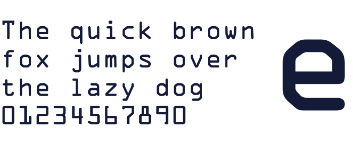
OCR-A Font, 1968
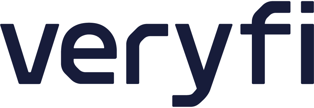
Veryfi Logo, 2023
Veryfi Green and the Veryfi Color Palette
From the company’s inception, Green was the primary color in the Veryfi visual identity and logo. From the beginning of our rebranding journey we expected to “lean in” with a green hue and imbue it with greater vibrance and intensity. We see this vivid green color as unique, fresh, and innovative within our industry, just like our company and technology.
This intense neon green is the main visual differentiator of our brand. It is inspired by developers coding tools.
Dark Blue represents our rigor and reliability. It features a strong contrast ratio against lighter backgrounds.
The only warm tone of this palette, which help us balance the tech forward feeling of our brand with a sense of trust.
White brings light and transparency to our visual identity. Excellent for copy and illustration usage.
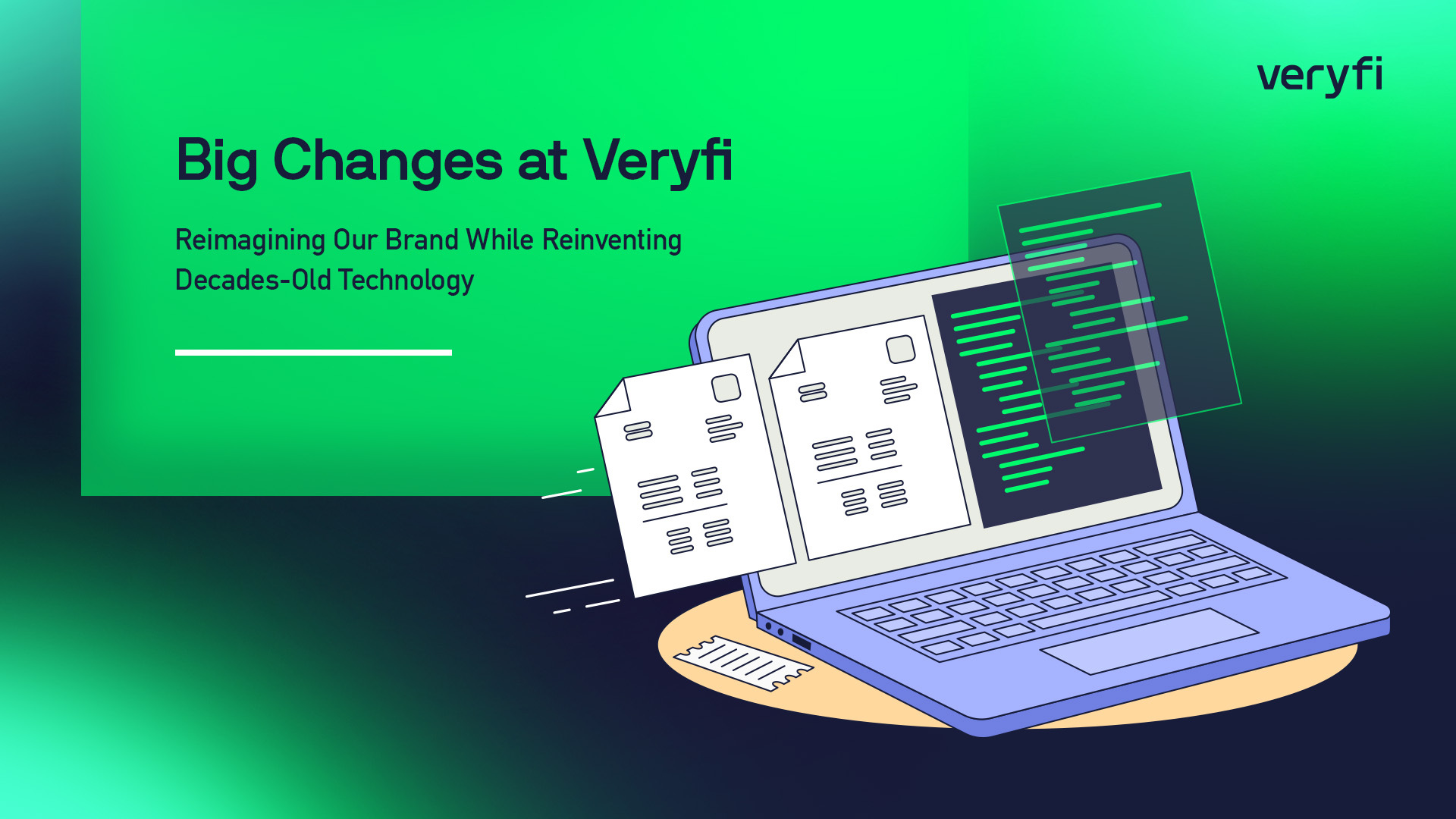
Veryfi Illustration Style
When we were deciding on a hierarchy of illustrations for the website, we considered a variety of illustration styles for images placed at the top of many key pages throughout the site. We wanted something that would visually balance our artificial intelligence technology with human emotion and values. Ultimately, we settled on a variation of the Corporate Memphis style, with an emphasis on creating an isometric space and using patterns based on our design system.

We also wanted to create clean product illustrations and animations that would not only show our technology in action, but also inform website visitors of its benefits. Many of our illustrations include representative examples of apps that might be created by Veryfi customers leveraging our technology.

To fully round out our design system, we expressed essential concepts like “speed”, “accuracy”, and “security” in a set of icons that used the same angled corners found in OCR-A, our logo, and elsewhere in our illustrations.
Inspirations
Innovation happens on a continuum, and builds on innovations from the past. We began working on our brand identity by reviewing other (mostly) B2B companies that inspired us. Here are some of the websites and brands from which we drew inspiration.
Stripe
Stripe is widely recognized for their beautiful website home page, and is frequently identified as an aspirational website for B2B software companies. Their design language includes a few approaches that are incorporated in the Veryfi brand:
- Standalone wordmark with intentional design cues that reinforce the rest of the visual identity (the diagonal dot for the “i” character reinforces the diagonal “credit card swipe” rectangle for Stripe)
- Vivid gradients with subtle motion and color shifts.
- Dynamic separation of web page sections, recalling other elements of the visual identity (the “credit card swipe” rectangle).
- Clean illustrations of their product.
- Developer-friendly views of code interacting with the Stripe APIs.
Block.xyz
Block is a design-forward website that challenges many design conventions while also reinforcing the intent behind the company’s rebranding from Square to Block. Their video included in the campaign assets file on their media kit page really excited us at Veryfi. Their website stood out to us for the following reasons:
- Vivid gradients with subtle motion and color shifts (similar to Stripe).
- Interactive elements on the home page.
- The use of color to create a memorable and distinct visual identity.
- Clearly acknowledging and embracing a developer audience.
- Aligning the brand with the design sensibilities of FinTech innovators such as blockchain and cryptocurrency companies.
- Unconventional navigation menu
Imagining Our Future
Reimagining an existing brand is always an intense, prolonged journey that presents opportunities for refinement, growth, and ultimately a deeper understanding of a company’s values and purpose. We’re proud of the work we’ve done to create a richer expression of our company, and hope that you’ve been inspired by that work.
While we continue to evolve and grow, continue to challenge ourselves and discover more ways to help our customers be more successful, one thing will remain the same about Veryfi.
Everything we do will be: Made with 💚 in California.